Eurostar Mobile App

What I did

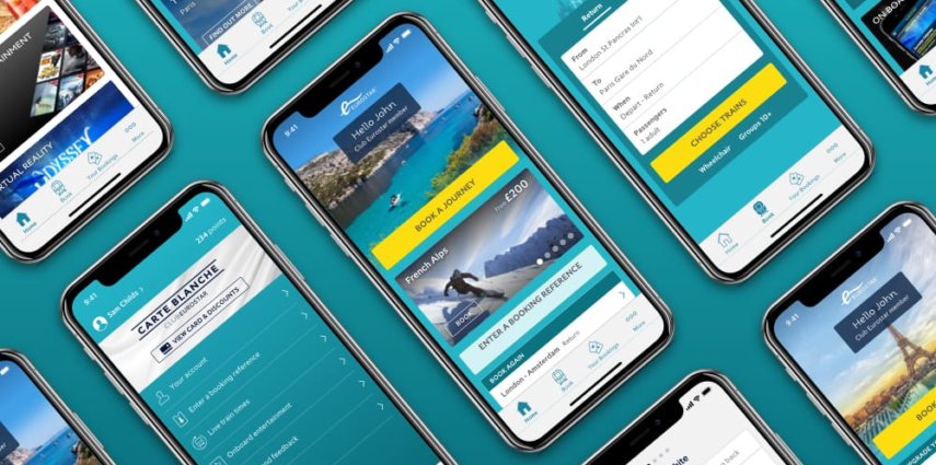
I began work on the app post MVP and was solely responsible for the visual design of the entire app. I worked closely with UX and was involved in design sprints and user-testing through to design and development. During the two years I spent at Eurostar I either redesigned or created the majority of the mobile app. As well as that I created accompanying marketing material such as promotional videos and app store assets. I was also heavily involved in the creation of the Eurostar Design System.


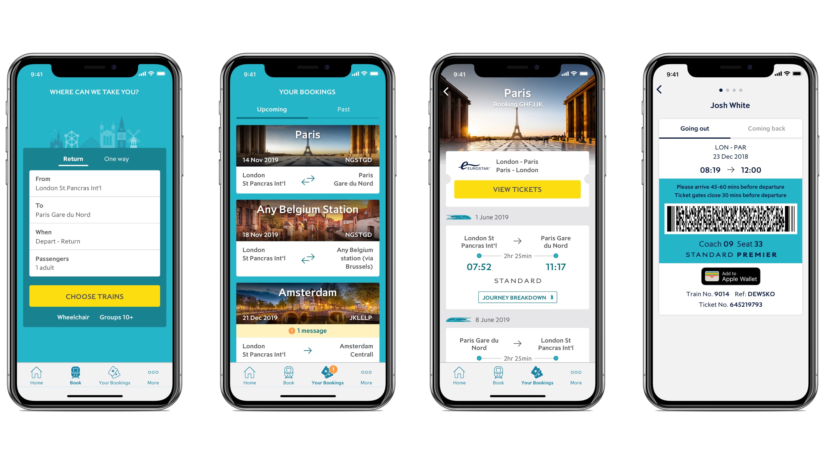
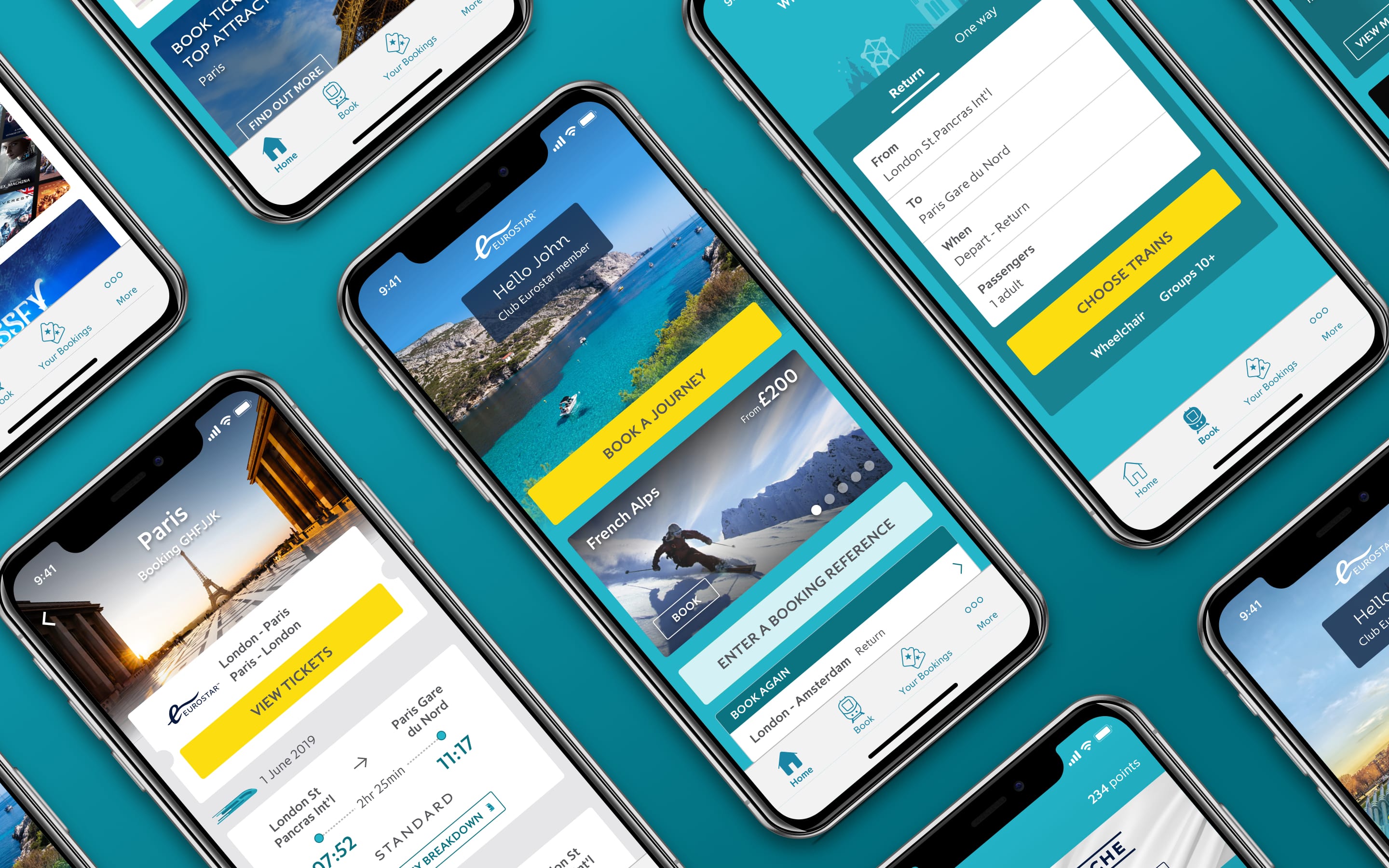
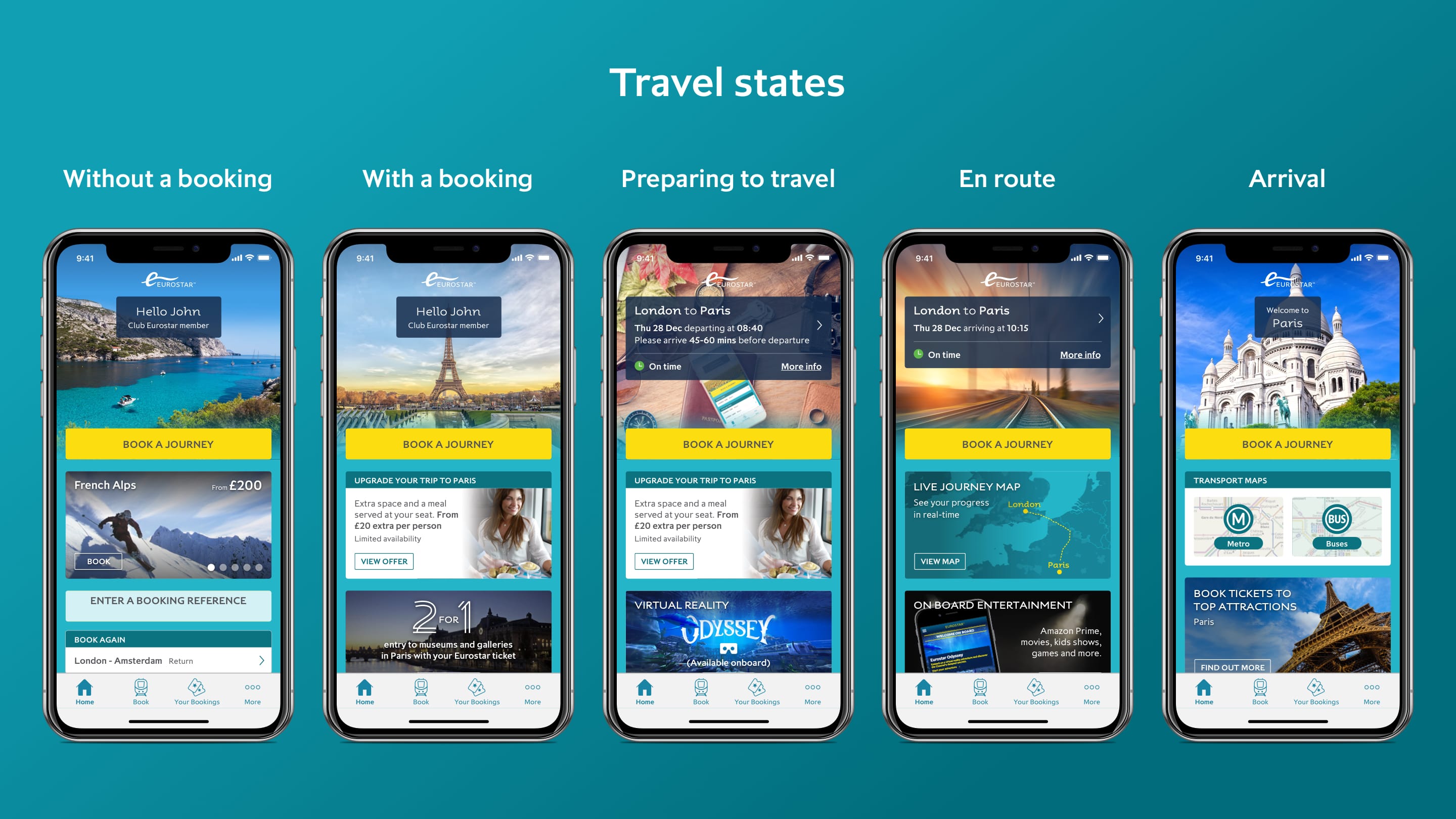
A dynamic dashboard to guide users along their journey

We created the Eurostar app not just to do everything a travel app should (mobile tickets, live train info, etc), but also to assist and inspire the user throughout their journey. The content on the dashboard updated throughout their trip to give relevant, useful, fun and inspirational content at each step of the way.

Prototyping and micro-interactions

Using a variety of tools including After Effects, Flinto, Principle, InVision and more, I created many prototypes to help sell in ideas and help bridge the gap from design to development. Below is just one example (created in Flinto).

Promotional videos

Created in After Effects to promote the app in various places from app stores to departure lounges all over Europe. Below is one example.

Resident Evil 7: The Experience

What they needed

Capcom needed an event site for their Resident Evil 7 Experience. The site was compact and succinct with a range of content and features spread across 3 pages.

ResidentEvil_home

Content

The site housed information about the event and the game, as well as exciting and before unseen content such as trailers and stills from the game.

Features

The site allowed people to add the event to their diaries, sign-up for updates, purchase tickets and contact the events team. Social feeds were also fed into the site.

Fully responsive

And of course the site was designed so that all content was available across all screen sizes.

ResidentEvil_mobile-screens

Foot Locker Press Portal

What they needed

Foot Locker needed an international, private access portal for the press to access a huge selection of product and campaign information including videos, images and much more.

FootLocker_01-Login

Easily updatable

It needed to be refreshed for each new campaign and/or product drop.

Content

Users could access and download various types of media and information for each campaign.

FootLocker_05-downloads2

Search features and cataloguing

The site also had powerful filtering capabilities for finding information about specific products or categories quickly and easily.

FootLocker_04-product-list

Multiple languages for multiple markets

It also had to be made available (and updatable) in several different languages for markets across the world (with the ability to add more if needed).

FootLocker_03-languages

Fully responsive

It was also designed to be accessible across all screens.

FootLocker_mobile-screens

Restaurant Branding, Video and Design

During my time as a freelancer I have worked extensively with the Scottish pop-up restaurant Dram & Smoke. I’ve worked on a wide-variety of projects from the logo design, web design, shooting video, photography, video editing and more. The close, trusted working relationship I have with this client has given me the opportunity to use my broad skill-set across several areas of design.

Below is a selection of work I have created for the Dram & Smoke over the last few years.

Brand Guidelines

Landscape-Brochure-Mockup

Responsive Web Design

DevicesDandS_1920x1080

Promotional Video

Shot on my DSLR and edited in Adobe Premiere Pro. Used to promote the Dram & Smoke’s winter project and featured on websites such as Shortlist.com

Photography

Shot on my DSLR. Used to promote the winter project and featured in print collateral as well as on websites such as the Evening Standard

Menu

DramSmoke_WinterMenu_v1_A5

EE Android App

User journey and wireframes

Although this was a simple app for users which allowed them to carry out an easy task of putting one mobile network (EE) against a range of others, we still had to make sure the user journey was as smooth as possible. We also had to factor in any admin screens and functionality. So I first created some high fidelity wireframes and put them into a user journey map.

EE_UserJourneyMap

Mobile app design

Then each screen needed designing up. The app was designed for Android and the screens were heavily branded as EE.


EE-cover

LaplandUK Website

Introduction

LaplandUK, voted ‘Best Family Day Out’, needed a website which could tell their story of Christmas in a charming and creative way, as well as make all of the existing useful information and features easy to find.

What we did

LUK_Homepage_1080p

We incorporated the story into the site itself by creating the homepage as an interactive scene of Father Christmas’ study. The stories Lapland wanted to tell were put into books which could be opened from the the desk in the study. The information pages were easily accessible in blueprints at the top of the scene on a shelf and were written by Father Christmas’ hand.

iPad designs

Desktop designs

Mobile designs

LUK_mobile

Bringing the site to life

UX

Previously, the LaplandUK web offering had lived in three separate places online – the brochure site, the booking portal and the booking management portal (all separate experiences for the customer). It was my challenge to both bring these entities together, as well as include the creative story telling aspect of the site. The result was one holistic experience.

LUK_family

CR7

Web design

Web banners

A suite of over 150 banners were created in formats to fit all different screen sizes, plus both static and animated versions were created.

Social content

Optimised for Instagram and Facebook and edited in Premiere Pro

Responsive email design

Film3Sixty Film Review Website

Film3Sixty needed to be seen as a thought leader

www.film3sixtymagazine.com

We and the team at OTM didn’t want readers to have to decide what to read, but rather serve them the content we created. So the homepage was designed as a feed of fresh content where readers could return each day for their film fix. Then, instead of categorising each item, these articles were arranged into collections. The feed would always display the most recent collection first and if a new article was added to an old collection, this would be displayed at the top of the feed.

F3S Homepage

Users needed to be kept on the site as long as possible

Whether entering the site through the homepage or sideways (through a newsletter, web search, social media or similar) we wanted to keep readers on the site. To do this we used two nifty features:

Reading list

Suggested articles were added contextually within each article, but instead of steering the user away from what they were currently reading, they were given the option to add to reading list, accessible at the bottom of every article.

Macbook_F3S_reading-list

Continuous scroll

Using the reading list and a tagging system to serve suggested content, our site would automatically load in the next article directly below the current one so readers could continue reading seamlessly.

Macbook_F3S_contunuous-scroll

The mobile readership needed to benefit from all these features

The new film3sixty website was designed using a mobile first approach, so all features were included for people on the move from the outset.

F3S Mobile Screens

We wanted film fans to spread the word

As well as the usual share functionality, we added shareable quoteswhich were as easy for the author to add through the CMS as it was for the film fanatic to share via Twitter and Facebook.

Macbook_F3S_shareable-quote

We needed to give the site a personal feel

Film3Sixty was created from film lovers for film lovers, so to help give the site a personal, more independent feel we ensured that the author(s) were constantly visible on every article, along with a photo and a link to their personalised profile.

An editorial site for a visual media

We used large, compelling imagery in the feed and in the header of each article. For the articles themselves, all IU clutter (nav bar and footer) was also made to disappear until the user scrolled upwards again. Below is a video created in After Effects to show the developers how certain functionality should work. It also demonstrates the no-clutter reading.

Finally, multiple Film3Sixty authors were needed to review the same film

To do this, each author was able to add to their own review to each article through the CMS. Then, for the reader, each author was displayed in the sidebar of every article and highlighted while their review was being read.

Macbook_F3S_multiple-review

Contact

Get in touch